


Fun with DNA data: how much does endogamy actually skew our matches?
🤓

So I often find myself wishing I had a better idea of how much my matches differ from the norm because of the Acadian/Creole endogamy. How much is the DNA sharing with my matches actually inflated by the fact that I share many common ancestors with basically all of my matches on the Creole sides? What should I expect to see for a given relationship, if I know that my results are likely somewhat skewed? How skewed?
So, being a nerd, I made a spreadsheet. I added 50 of my grandfather’s closest cousins in there and included the closest known relationship only, the amount of DNA actually shared, and the average and range of shared cM for the relationship provided by DNAPainter’s sharedCM project.
The pattern I noticed first is that while we may share many distant-ish ancestors, the amount of shared DNA almost always falls within the range for the closest relationship. It’s almost always on the high end, but rarely does it fall completely outside the “possible” range. If it does, there’s a good chance I’m just wrong about our closest relationship because not all of these people’s trees are completely known by me. (This is assuming we don’t have multiple close relationships and are just third, fourth, fifth etc. cousins a bunch of ways. If you are both first cousins and aunt/uncle the amount of DNA shared would be closer to adding the expected amounts together.)
I decided to feed my little spreadsheet into an AI (Grok) and ask it to analyze for patterns. The results were pretty cool!
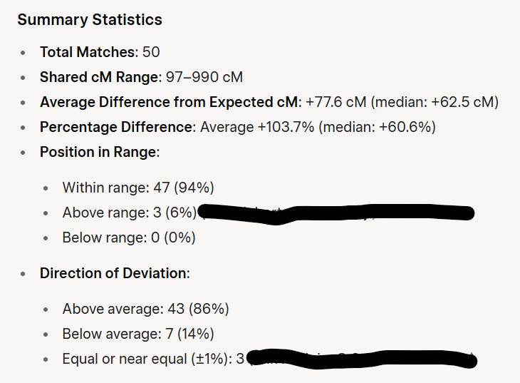
So 94% of the matches are within normal range for the closest relationship. The three that are above are people I suspect have a common ancestor with me who is closer than the one I’m aware of. The vast majority share a more than average amount of DNA for the relationship, but it’s not so much it totally throws us out of range.
Things can look more skewed the more distant the relationship is.
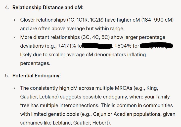
It even told me there’s probably Cajun endogamy, LOL. (I had MRCA labels on the spreadsheet, which is how it knows about the surnames.)
Then, I asked it to make a visualization. It spit out some Python code which I then ran to produce this:
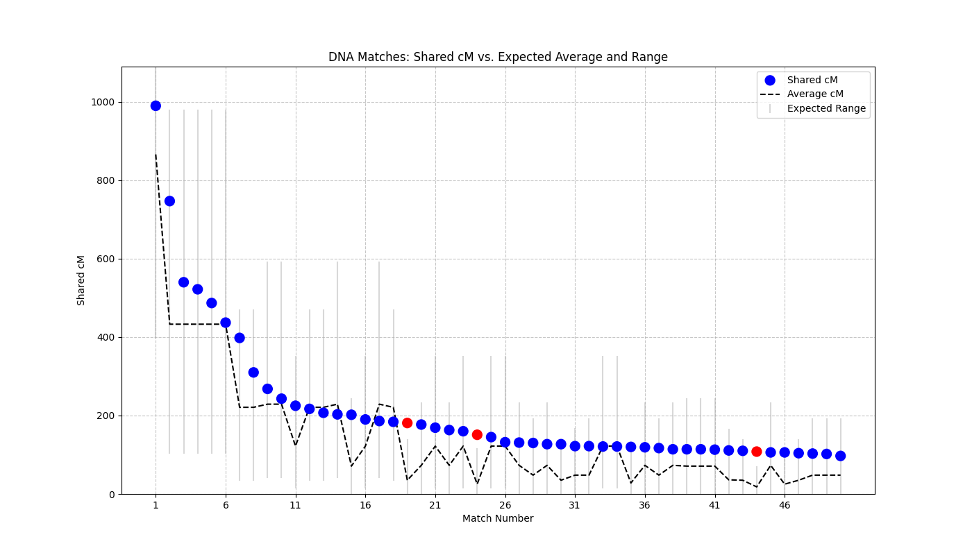
Which shows the same thing I have just been discussing in the form of a nice graph.
So if you have ever wondered what you should expect to be different from the standard DNA wisdom if you come from an endogamous population, here’s some data to support your thinking. In my case, at least, there’s a clear skew up in the amount of DNA shared, but it’s not so extreme that DNAPainter’s ranges no longer make sense.
I only did this for my grandfather’s paternal matches, but I’m curious if it would look different at all for, say, my mom’s matches. I’ll have to test hers out at some point! But not right now. Making that spreadsheet was very tedious. 😂
Impressive. I admire your dedication. This sounds complicated, and a bit intimidating.
Nice work. My cousin and I found a case of brother sister incest from 1860. The presumed father had children with three different women (including his sister) and the amount of family line DNA was exactly double for the incest line compared to the non incest line. With legal records, DNA evidence plus circumstantial evidence it was quite clear what happened.